Healthcare · Design-led
Relode
One design system for every healthcare hiring workflow.
Relode's products had grown faster than their shared design language. We audited the experience, then built the typography, colour, icon, component, and page-layout rules needed to make candidate, referral, and employer workflows more consistent and faster to design.
- UI/UX
- Product Design
- Iconography

The challenge
To create a unified design experience for Relode’s growing digital products and increase efficiency through accessible, consistent and reusable components.
Design audit
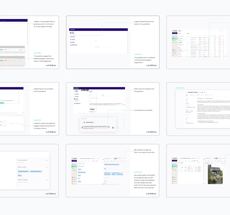
We analyzed every page and identified UI and UX findings, errors, and elements we think can be improved, asking ourselves questions like: is the navigation consistent and accessible? Are the icons meaningful and easy to use? Is the typography consistent throughout the apps? Where do the users get stuck or lose valuable time?
Design system
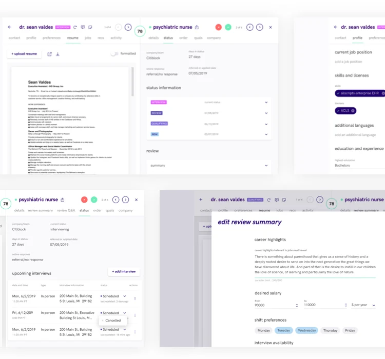
Using the existing visual guidelines in mind, we started building a set of components, patterns and rules.
Typography
We created templates, updated rules for line-heights, formatting, and sizes as well as font style usage and line length.

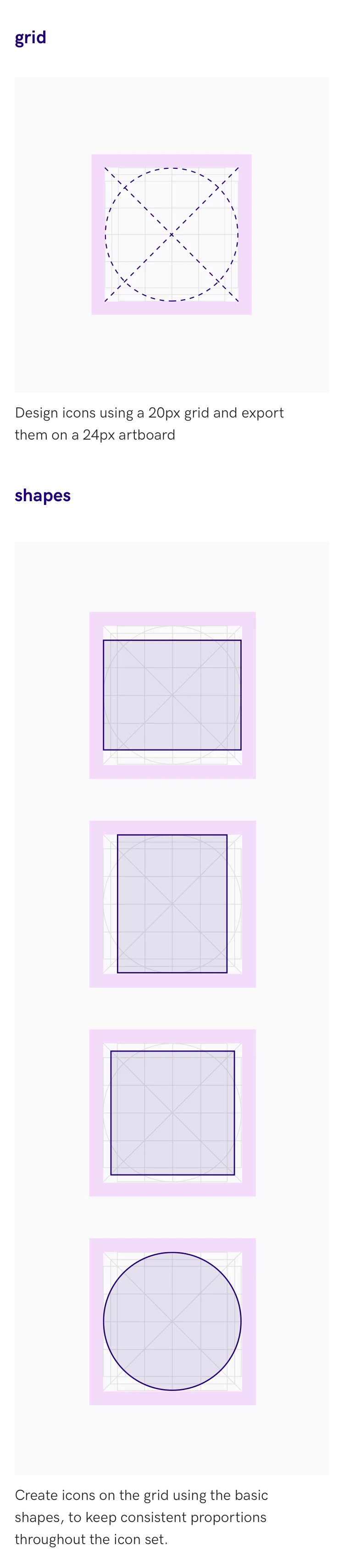
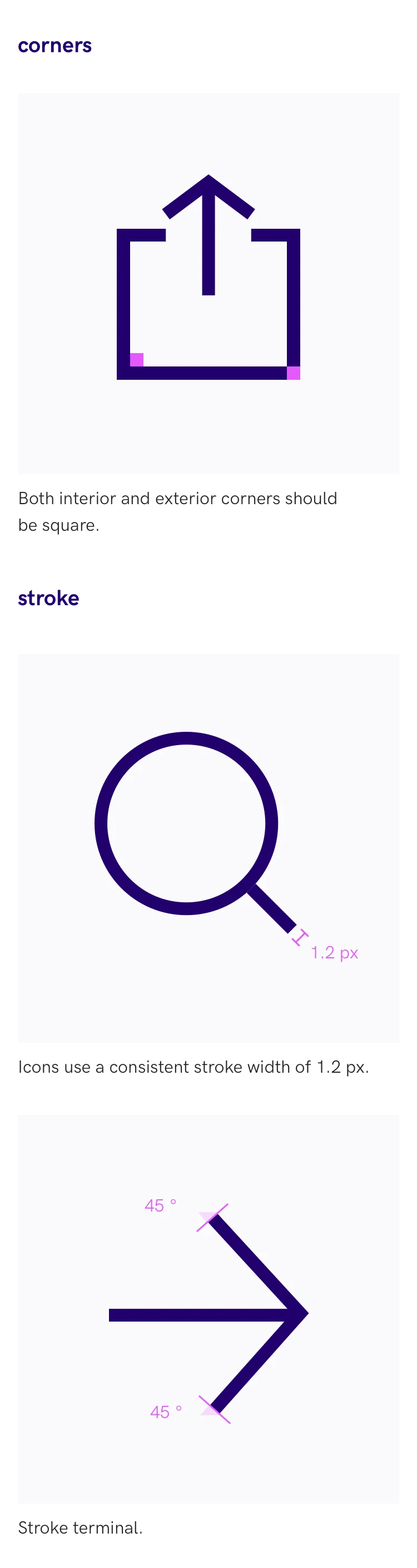
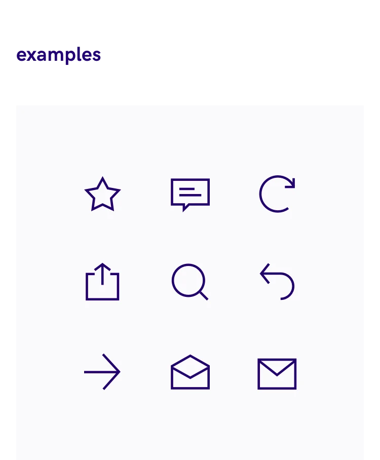
We created an icon grid, established icon styles, and sizes that work for different kinds of applications and products.
Color system
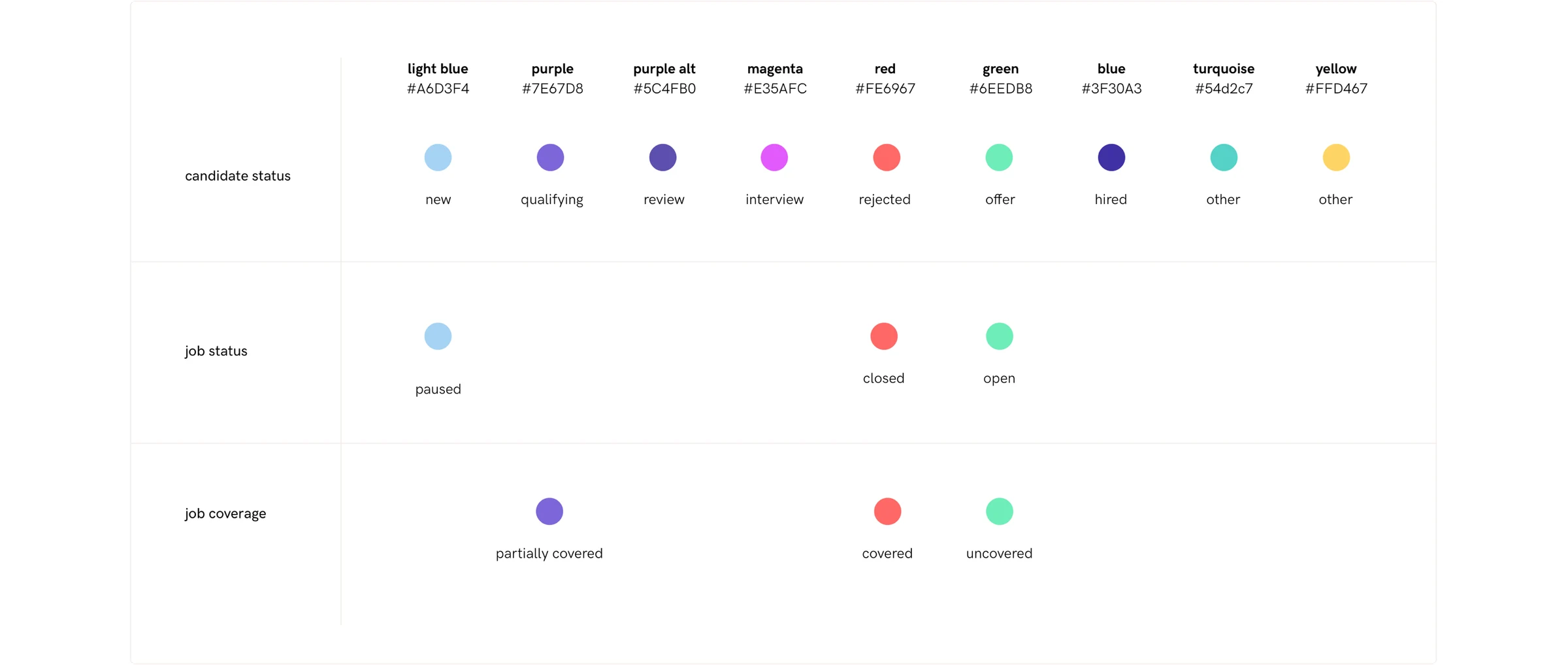
The consistent use of color in Relode’s product gives users quick insights about jobs or candidates, help identify actions and statuses, while insuring an engaging experience.
Components
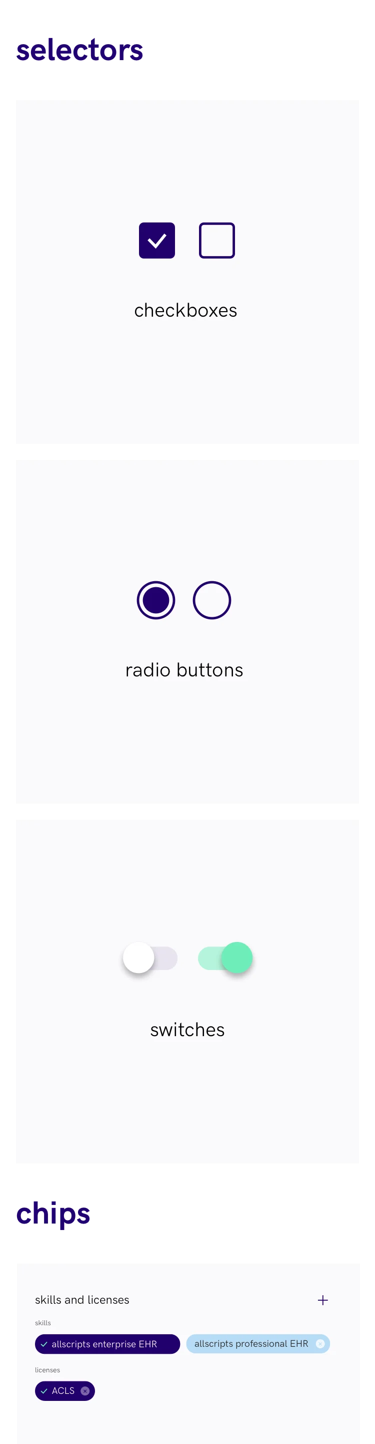
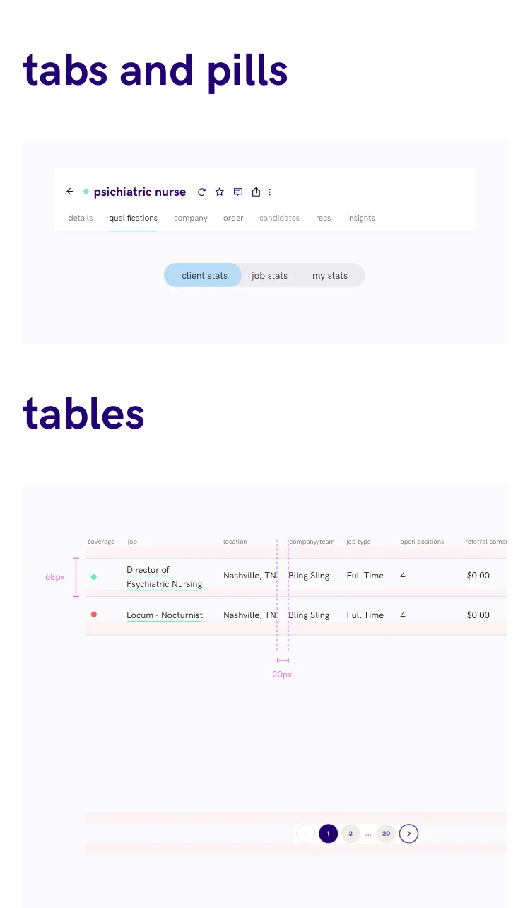
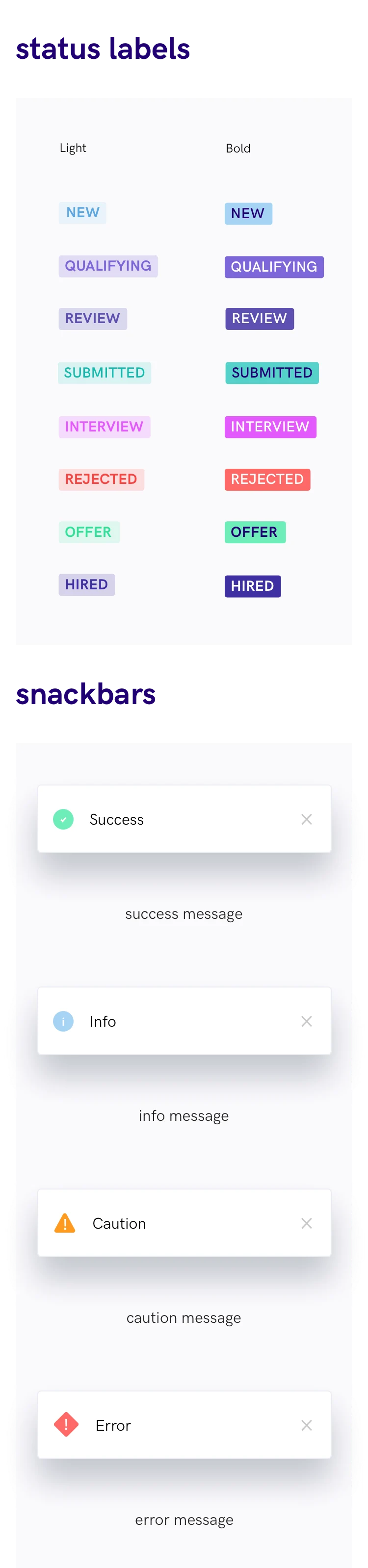
We built a set of rules, along with best practices and exceptions, for designing and using components like: checkboxes, date pickers, flag messages, selectors, chips, tabs, status labels, tooltips, modals, progress trackers. Phew, that was a long list.

Page layouts
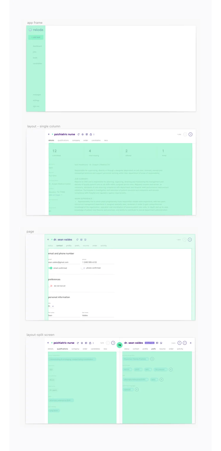
Provide information about how a basic page structure looks like, what are the best ways to arrange the content on a page, how to use columns and how are the components positioned in relation to one another.